Tales of a Callsheet Icon
Posted 1 year, 45 weeks ago.
Download Audio Version (7.02MB)
I was listening to Accidental Tech Podcast one day, and my good mate Casey Liss was chatting away about his upcoming app, Flookup. I don’t recall if he’d let anyone know what it was or what it was called at the time, but I was one of the lucky few who got a TestFlight build quite early on.
It was a great little app, even at that early stage, but the icon let a lot to be desired for me. Casey is many things. A great friend. An excellent developer. A half-decent podcaster. But an artist?
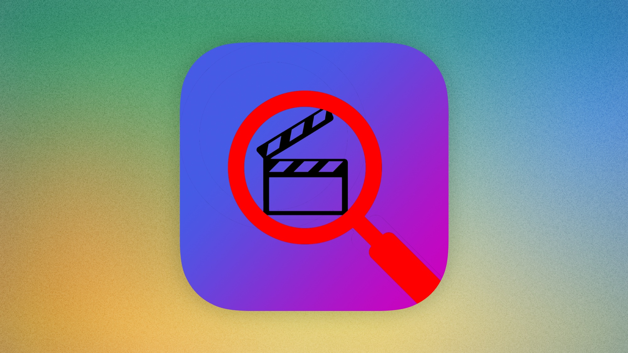
It’s no message bubble with feet, but the concept has hands.
So I found myself opening up Sketch and getting to work. Could I make an icon before the episode was done?
I found the concept that Casey had going on quite compelling. The idea of searching a slate (a.k.a. clapperboard) for information about a movie or TV show made sense to me, so I felt like that could stay. It was really just the framing that didn’t feel right to me. A tiny slate buried inside the lens of the magnifying glass would be easily missed. It needed to be bigger.
When I realised that you could highlight something through the magnifying glass—literally be searching for information on the slate—the concept really came together. A big slate with a slightly less prominent magnifying glass, searching for information about a movie. Casey had been so close to gold, and he never even knew it.
Back in the early days of iOS, I remember jailbreaking my iPhones to use custom icon packs, and I was always a fan of the ones that reimagined things in the squircle shape of the iOS icons, filling and using the shape to their advantage. I could envision a 3D version of this icon, slightly tilted and open, maybe used on macOS or similar, and the idea of a squircle-shaped slate spoke to me, so I decided to start there.
I’m not going to share photos of slates because many of them cost money to be licensed—money I don’t have—but you can do your own image search for “film slate” or “clapperboard” if you want. You’ll find that there’s basically two variations. A black version, which is more traditional, and a white version which seems to be more common these days. The latter felt right for an iOS app, since icons are (were?) often light mode rather than dark, but I could always do an alternate later if I wanted.
Ok, so first things first. We need to sketch this idea out.
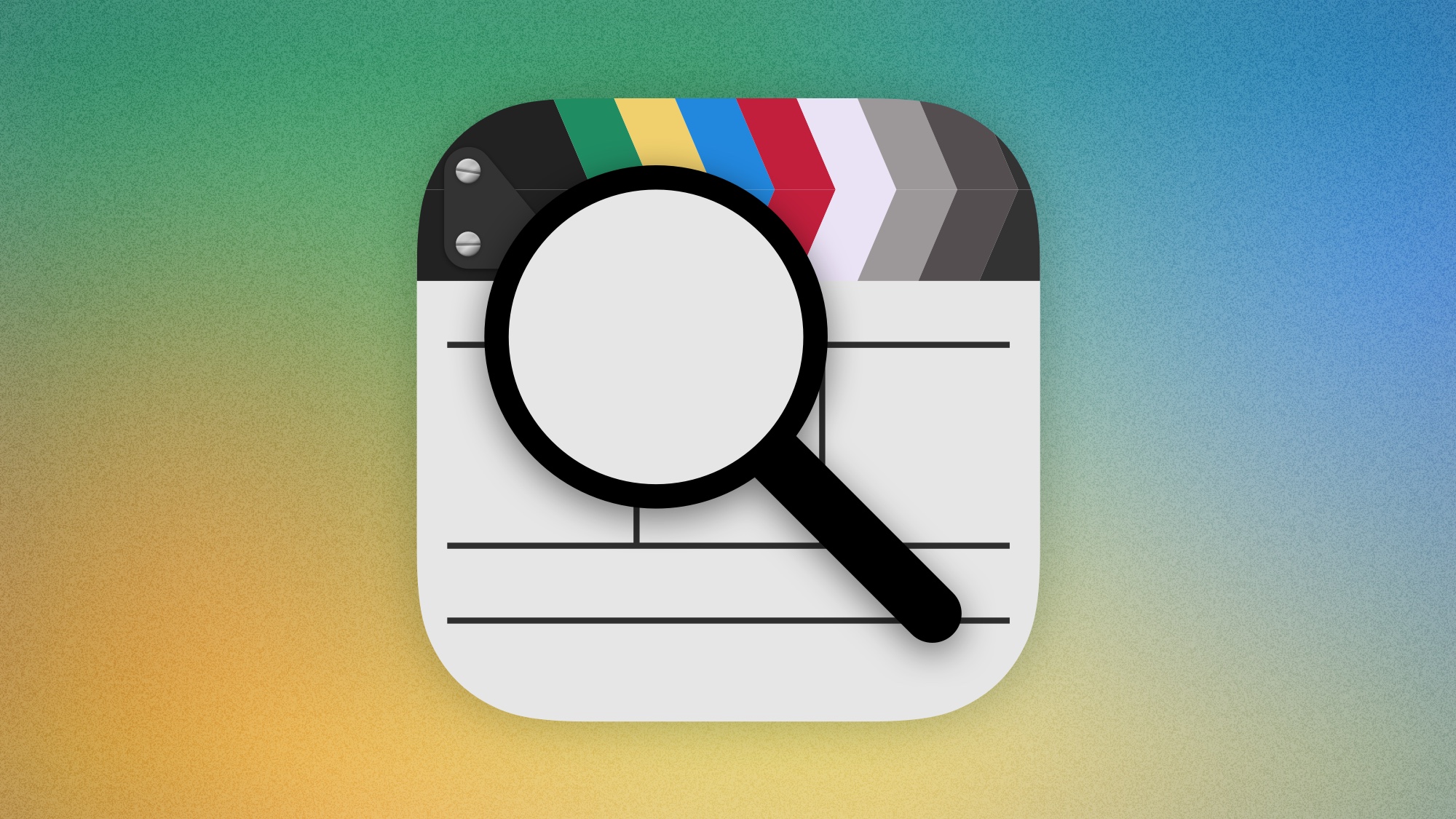
The top of the slate is the key to it looking right, and I quite liked the colour versions I found in my searches. They felt more modern and visually interesting, even if they’re not the traditional, black-and-white ones people are most familiar with. I laid out one row, and vertically flipped it for the second. Then I spent a properly irresponsible amount of time putting together screws for the hinge.
Next came the lines that divide the slate into the various areas where information lives. I wanted to add some detail in these, so I was careful to match what I found in references, leaving spaces for things like the roll, scene, and take numbers, the production title, the director’s name, and the production date. I figured I’d come back to these in a later pass.
And finally, the all-important magnifying glass, centred over the top of the slate. I toyed with the idea of making it more detailed, like I had with the slate, but I actually found myself liking the silhouetted look, which provided some contrast against the slate itself.
This felt like a great start to me. Not finished by any means, but at this point I had run out of time. The episode was done. So I took a screenshot and sent it to Casey.
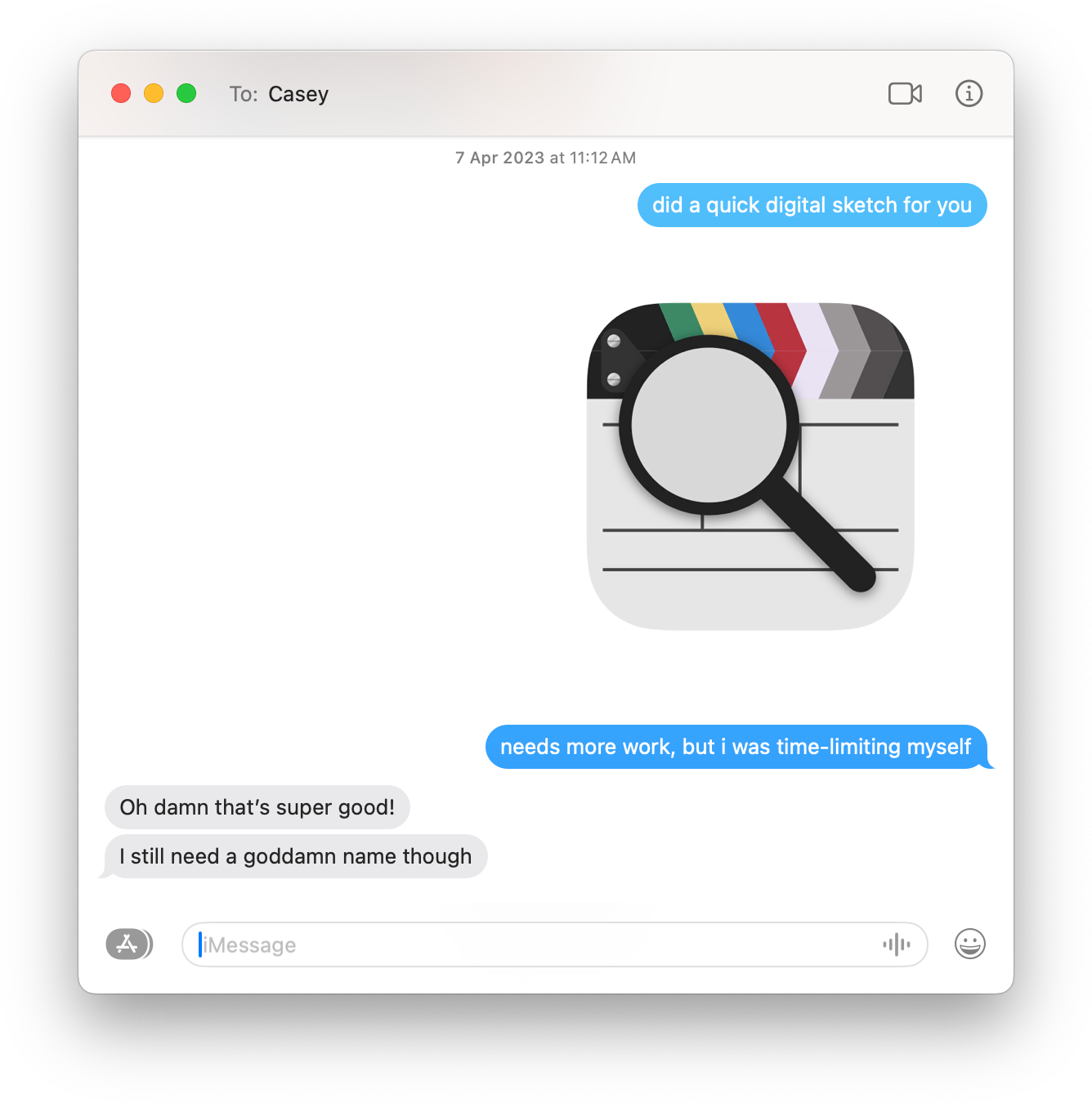
Not pictured is my response to Casey telling him to name the app ‘Callsheet’.
Knowing Casey liked the direction I’d taken was all I needed to forge ahead. I wanted to fill it in with a little more detail; stuff that wouldn’t necessarily be obvious on a home screen, but it’d bring the piece to life.
A lot of slates have a thick clapper stick, while the board where things are written is quite thin. Given that I was also not 100% happy with how well-defined the clapper stick was, I decided the best way to help define the shape was to add some highlights and shadows to subtly indicate it was a little thicker than the rest of the slate. These are all technically done with shadows or inner shadows, where I simply use a white colour to add highlights.
Then I added the detail, using Casey’s all-time favourite movie as the source. I looked up the director and release date (only to realise later that it was the Australian one because websites insist on showing local release dates), and I filled in the slate.
The role, scene, and take numbers are also a reference… to Casey himself: his birth month and year. I figured no one would really pay attention to these details, but it was kinda nifty having them be there.
I also used an illustration trick, where I took a blue to purple gradient and blended it over the slate. This helped to bring all the colours together and makes the whole thing look a bit less flat. The blue is barely noticeable, but the purple does kinda show up if you’re looking for it, and gives just a hint of the colour Casey uses in the app itself.
The final tweak to the slate was a mask over the dividing lines I’d added, which make them follow the shape of the icon itself. It’s a small detail that helps to make the icon look better in-situ. This mask also assisted with where to inset the ‘Date’ label so it wouldn’t be cut off, the lucky part being that it lines up with the right of the ‘Director’ label in such a way that it seems completely intentional.
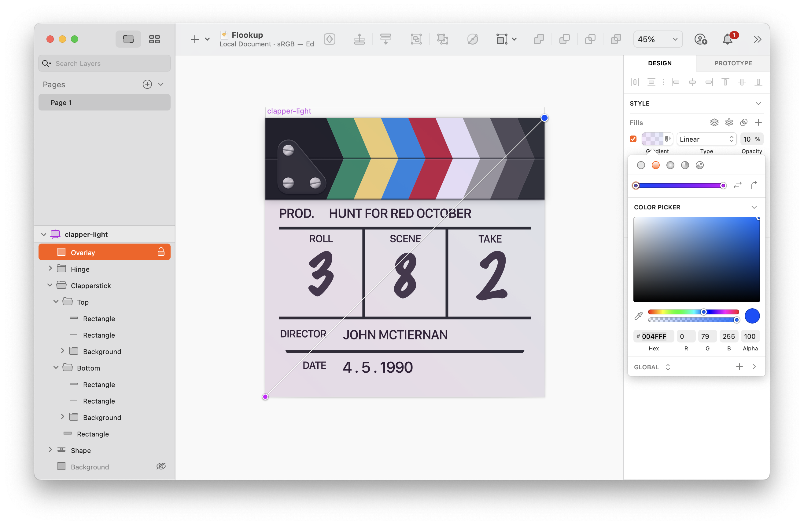
The gradient from Casey’s original version lives on.
With the slate feeling complete, I turned my attention back to the magnifying glass. First and foremost, it needed something to help it standout from the darker parts of the slate. For this, I added some glow by means of a white shadow with a lot of blur.
To deal with the part of the icon visible through the lens, I used Sketch’s symbols to duplicate the slate: one instance for the background, another for the part in the circular cutout of the magnifying glass. The inner part is scaled up, which gives it the effect of being magnified, and with a subtle gradient overlaid to mimic the distortion without actually distorting the image. A little specular highlight helped to sell the glass.
At this point, I realised it was a little dull when used on a home screen (by using Shortcuts to create an icon on my own phone and living with it for a little bit). To combat this, I added a gradient background to the slate which brightened the board, particularly in the area under and around the part visible through the lens.
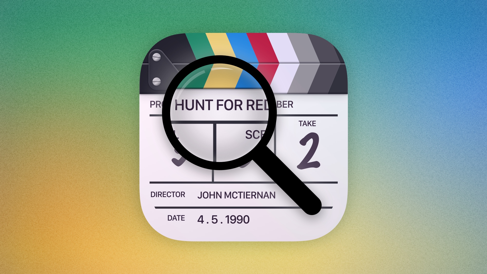
This is the version I sent to Casey, and the version the app launched with. I hadn’t really intended to make the final product, especially since Casey’s previous apps had icons from the inimitable Ste Grainer. Regardless, the influx of warmth as people discovered the details was a huge delight.
Nothing changed about the icon until Casey had an inquiry about the details it depicted from Apple’s marketing department. They wanted to know if we had permission from the appropriate people, and rather than fight it, we figured it was best to just change the details, swapping them out with a version that would be safe from questioning.
Casey suggested “The Search for Blue March”, and I mostly stuck with it, only opting to change the month to “December” because I felt gave a better nod to the original. “Kay Celis” became the director, a pseudonym that makes way more sense if you say it out loud. For the date, I opted to use Callsheet’s launch date. It felt appropriate.
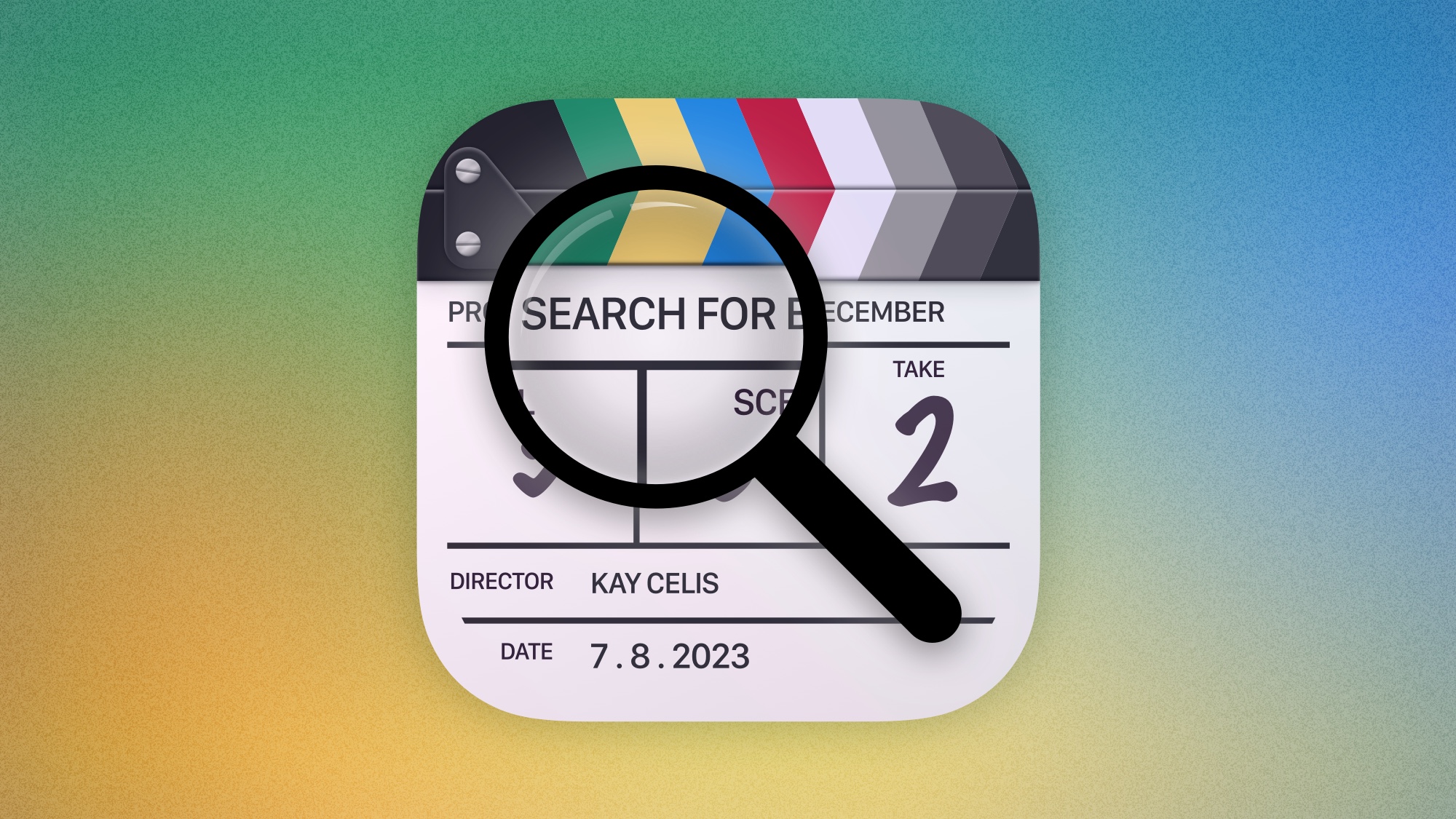
This brings us to the current version of the icon… for light mode, anyway. Wildly enough, I created a dark variant of the icon almost immediately after I finished the version you see here. Casey never really made use of it, though it just hit TestFlight this week. Besides, with iOS 18’s new dark mode and tint-able variants on their way, it’ll probably still get its time in the limelight yet.
Like I said previously, I never really intended for the icon to be the one that Callsheet shipped with; I just wanted to see what I could do with the concept Casey had come up with. That said, I’m so happy that the icon has gotten such a wonderful reception from the fans of Callsheet. I really appreciate how much you all have enjoyed my work… and I can’t wait for you all to get to use the dark variant as well.
Of course, if you haven’t tried Callsheet, you really should. Casey cares about the people who use his app in a way that his main competitor (IMDB) doesn’t. It’s an excellent app, and I’m proud to be associated with it. It’s available on iPhone, iPad, macOS, and Vision Pro.