My Process for Illustrations
Posted 9 years, 16 weeks ago.
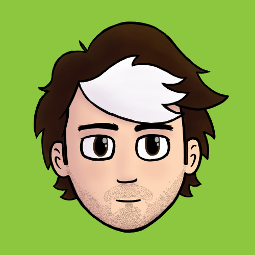
I’ve wanted to share my current process for doing illustrations for a while (it’s changed a lot over the years), but never had a good, simple example to work with. This year, I felt like it was time for an avatar upgrade: my previous one was an illustration done in 2011 for my wedding. So! Time for a new self portrait.
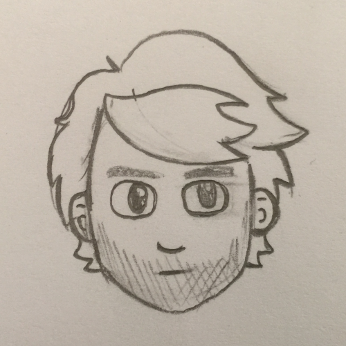
Step 1: Sketches
I like to sketch the traditional way, using a mechanical pencil and paper. I find that this helps me get all of my ideas out quickly and find the one I want. These are usually done small, even large images (like this one) aren’t any bigger than an A5 sheet.
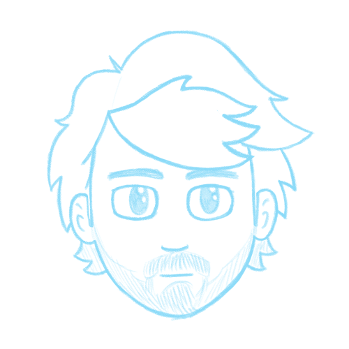
Step 2: Pencils
Once I find a sketch I like, I take a photo of it with my phone and stick that in Photoshop. At this point, I figure out what my canvas size is going to be (usually at 600dpi), and scale the thumbnail accordingly. This is usually way too low-res to go straight to the final line art, so I do pencils in blue over the top.
This is where I nail a lot of detail. Many artists will keep their pencils rough, but I usually like to get as many details taken care of in this initial state: this is especially helpful when I’m doing portraits of people, as it means I can get them looking right before I start inking.
I make full use of the ability to cut pieces out and reposition them against each other, or duplicate things (like the eyes here).
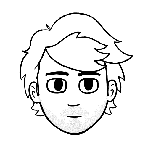
Step 3: Inks
Now that I have everything nailed, I go over the pencils with solid, black brush in Photoshop. I use multiple layers for this; a layer for the background, a layer for the heroes (because that means I can pull them out and use them separately), and additional layers for details I want to be able to finesse (like my stubble in this).
This is where my rule about 600dpi comes in handy. Because I know the image is much larger than it’ll be printed/viewed, I’m not as fussy about super clean lines. Scaling the image down means that imperfect lines still look clean.
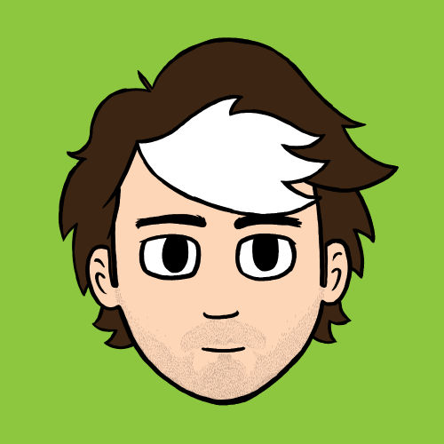
Step 4: Flatting
Flatting is the term used for filling in the inks with flat colours. I have an excellent plugin for doing this from BPelt that makes this a piece of cake:
- Duplicate my inks and flatten the copies onto a single layer with a white background.
- Use the Threshold tool to harden the soft edges of the lines.
- Use the BPelt Multifill plugin to fill areas with random colours.
- Use the BPelt Flatten Pro plugin to remove the black lines from the layer, making this layer solid areas of colour.
- Using the Fill tool, replace the random colours with the desired colour palette.
If parts of the image are going to be transparent, like the green background on the avatar, I’ll usually fill them with magenta while flatting and then just select all of these magenta areas (the “Contiguous” checkbox is your friend) and delete them in one go.
Hot tip: I’ve accumulated a colour palette over the years with swatches that I use regularly (like the hair and skin colour here). I also keep various colour palettes for each commission I do. If you draw the same thing a lot, doing the same will come in very handy.
Step 5: Shading and Highlights
At this point, I start selecting areas of the image (using the Magic Wand tool on my flats) and adding shadows and reflections in various layers over the top. I don’t just do this with black and white, either. Using darkened versions of some of your colours and using the Multiple blend mode will help make everything feel cohesive.
I also have a tendency to use a dark purple for some shading across everything. Mostly because I like it, but it does help to mute the colours a little, which is nice if you tend to use highly saturated colours when flatting.
Step 6: Image Composition
With shading complete, the image usually does look finished, but I like to add some colour overlays and basic effects like vignettes before I’m done.
Colour overlays (using a variety of blend modes) help to pull the colours together, and can give everything the feeling of consistency. It also helps if you want to adjust the lighting or ambience: in a recent illustration I did for a friend, I used overlays to make the colours feel a bit more like the scene was set in the late afternoon (desaturated and slightly cooler colours), as opposed to the middle of the day (warm, saturated colours).
Subtle vignettes and similar effects help to draw the attention to where I want it. I typically apply a dark, circular gradient (at a very low opacity) centred on the heroes. I’ll also duplicate and blur my flats, then overlay them to add a sort of soft focus effect that makes everything seem a bit brighter and ethereal.
A lot of people think that illustration is some sort of magical ability which requires skills or talents they could never have. In truth, it’s just a matter of learning basic techniques and applying them over and over again. Practice makes perfect, as they say.
What they don’t tell you is that you’re always practicing.